Typeface Poster
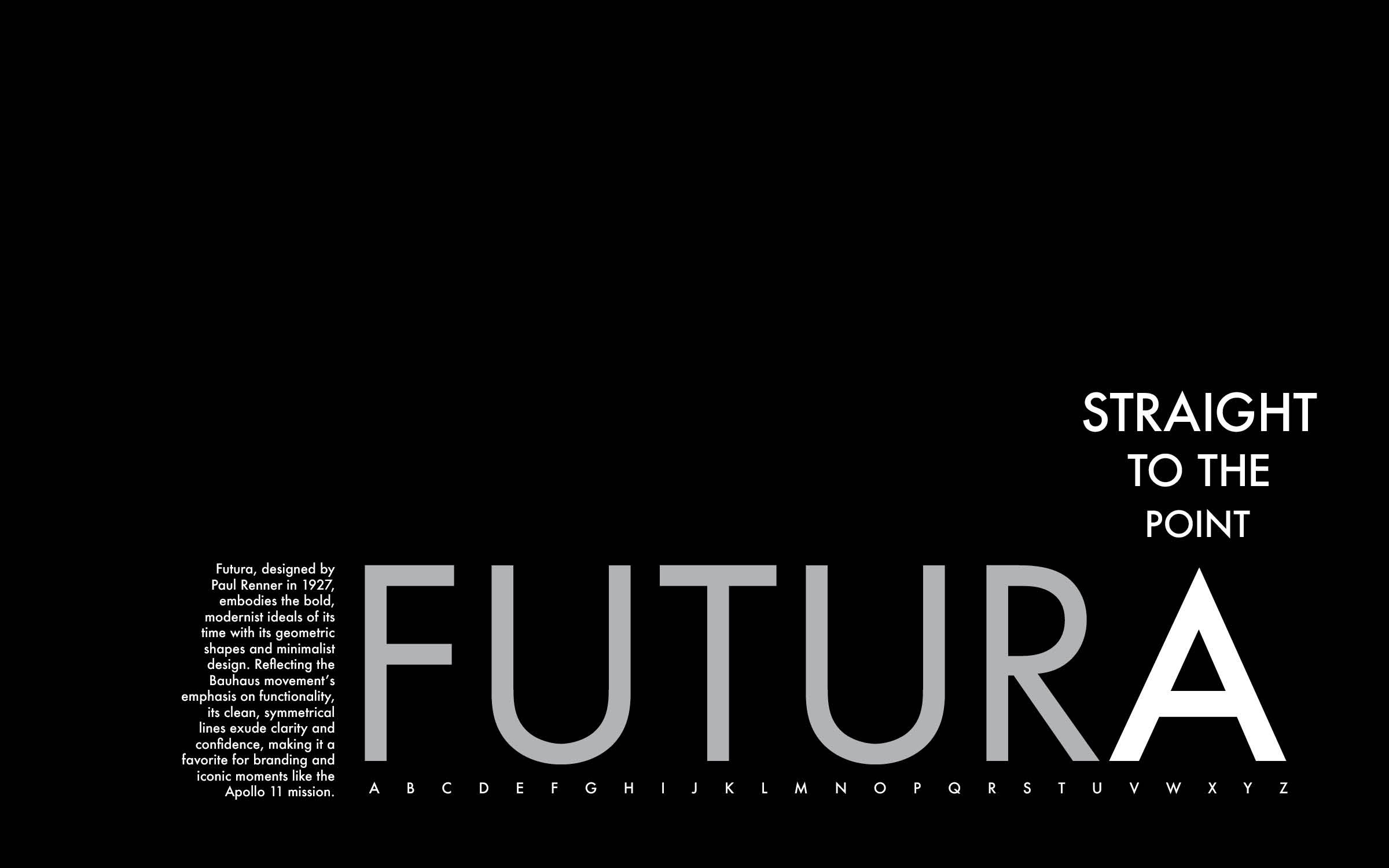
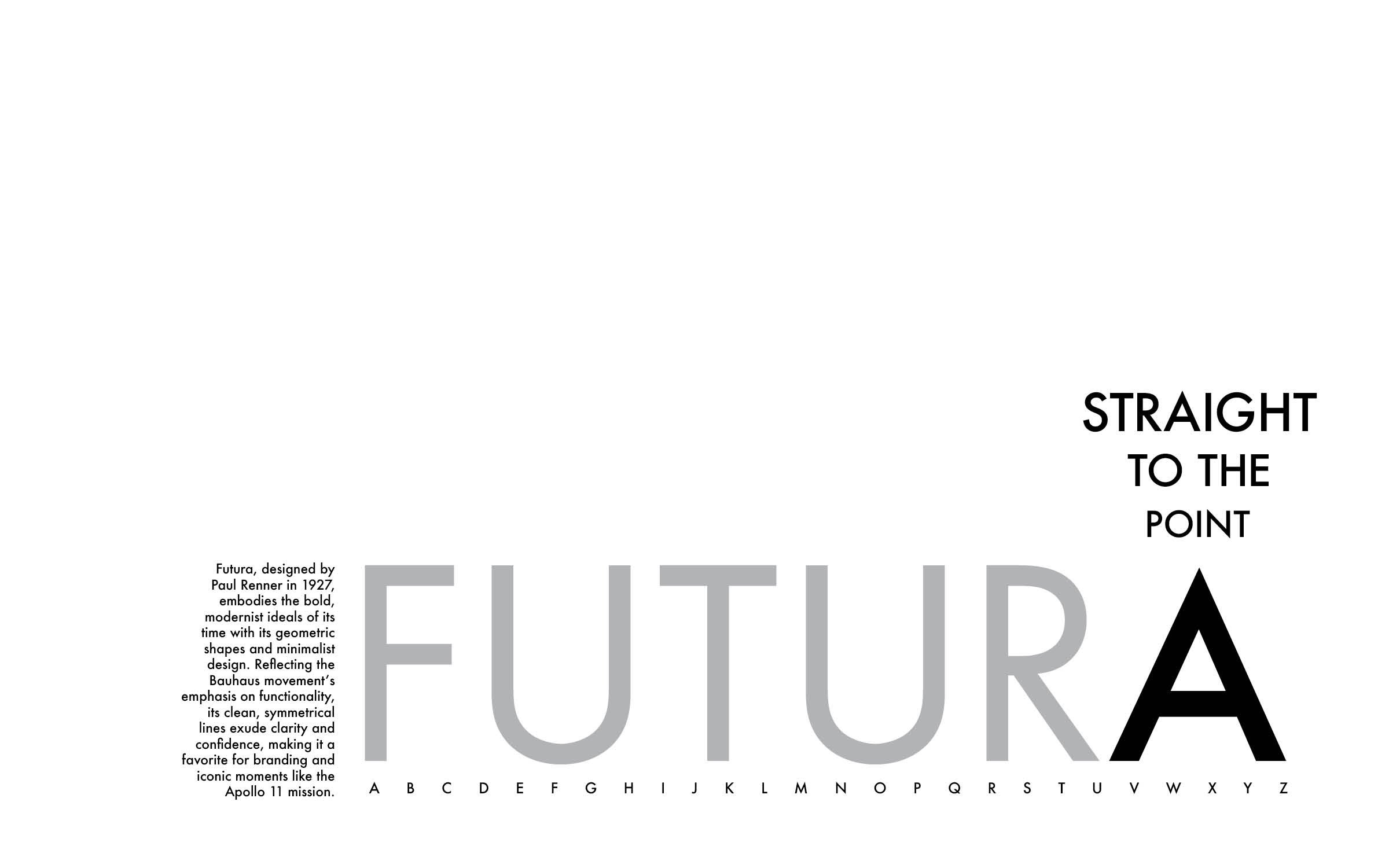
To represent the history and style of the Futura typeface I designed this 10'“ by
16” poster. By researching the story behind its origin I learned that the font was designed to represent modern ideals through its clean lines and geometric shapes. The use of the font name in all caps at a large size shows off the crisp corners. Further, the tagline reading '“To the point” emphasizes the sharp points on the apex of the “A” and baseline of the “V” and “W”. Finally, the small text on the left side of the page and spelled out alphabet at the bottom of the composition draws the reader into a closer viewing distance. By placing the designs between the baseline and the lower 1/3 line but towards the right side of the page, the idea of forward progress is conveyed similarly to the ideals of the typeface.
Although the black background better represents the stark contrast and its use in outer space, a version with a white background is also provided.


