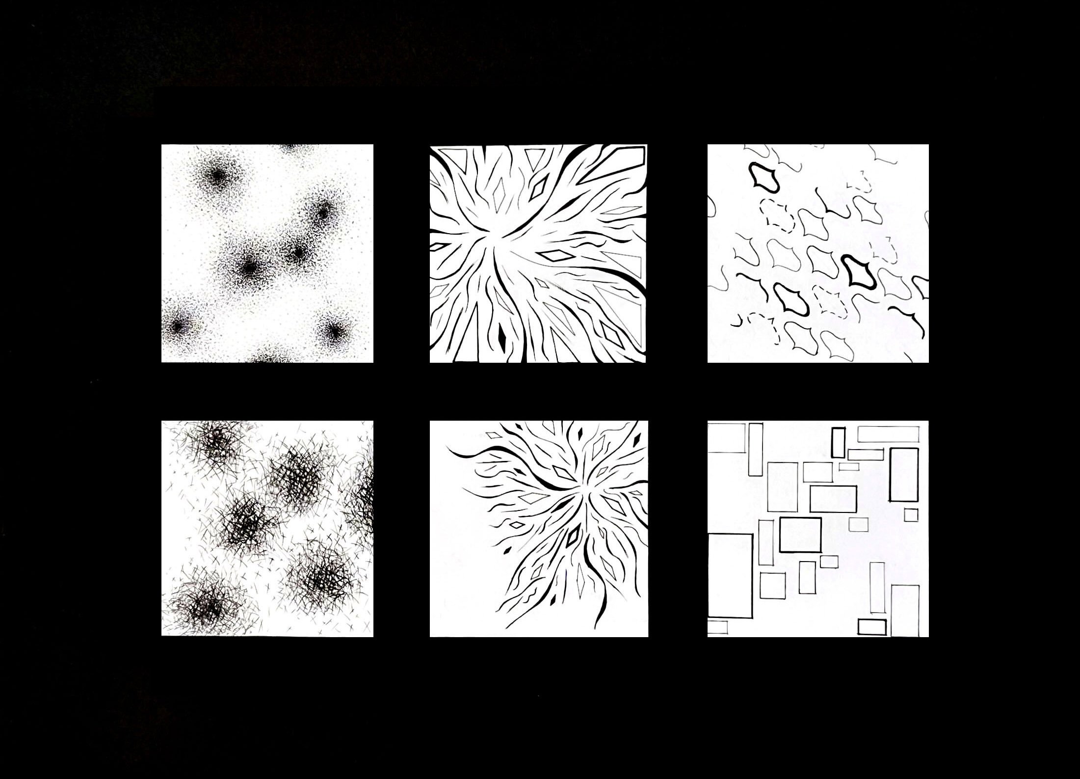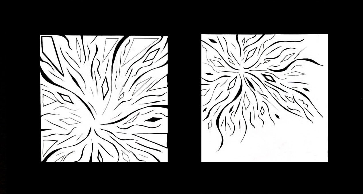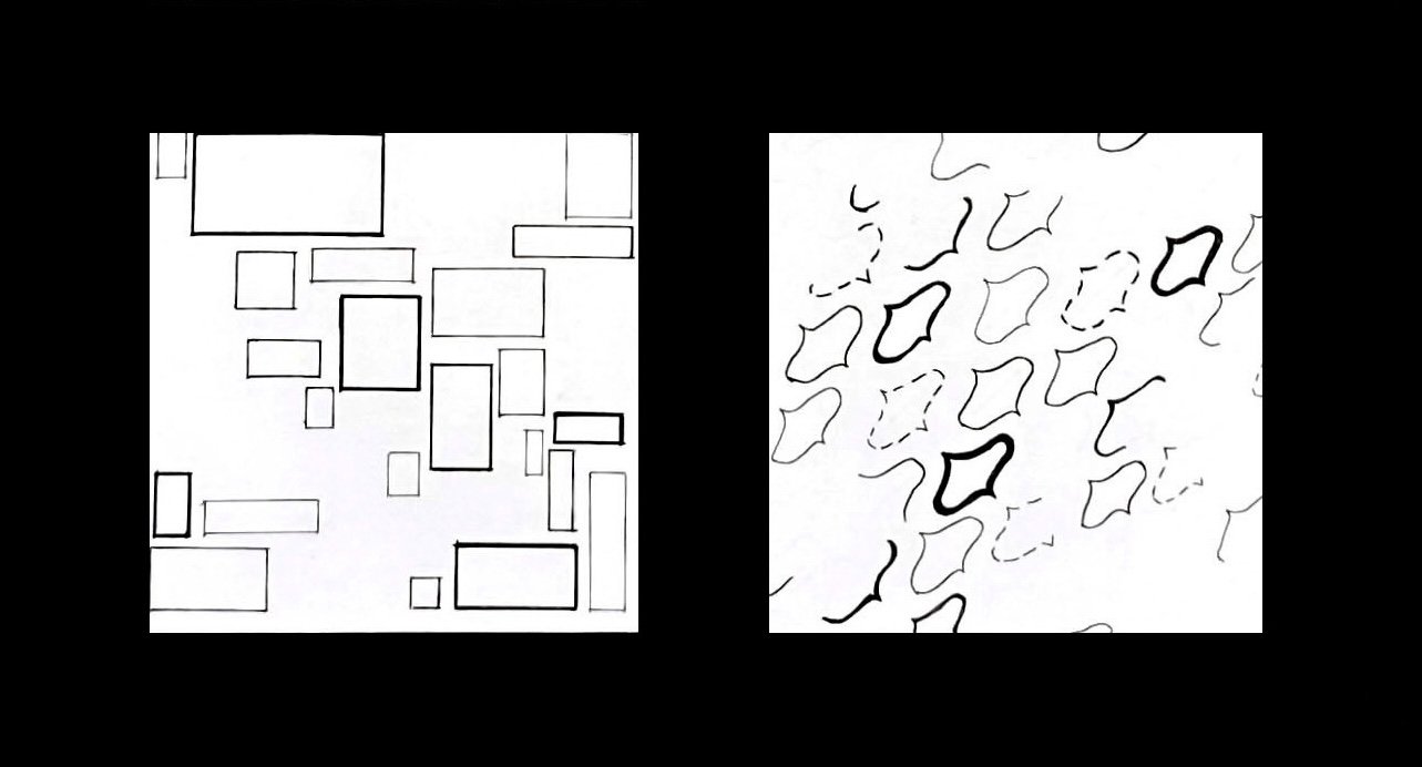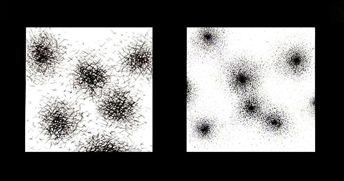
Line, Contrast, and Emotion
One of my first design projects while studying at TCU was to show contrasting principles using only ink pens. I started by sketching plenty of thumbnails before remaining with my ideas and progressing to the ink finals. The principles represented are rough vs. smooth, compression vs. expansion, and modern vs. traditional. The concepts are shown below respectively.


